Kupu 3.0
Kupu is a Māori Learning app developed in conjunction with AUT and Te Aka Māori Dictionary. Kupu uses Google machine learning and your phone's camera - so you can take a photo of a common object, then have the app tell you the word for it in te reo, along with an audio clip to help your pronunciation.

Brand Identity
Details
Project type: Group Project
Category: Educational App
Project duration: 8 Weeks
The team
Role: Brand Identity & Illustrations
Collateral: Saints Tuitama
UX/UI: Corey Horgan
Brief
How can we reminagine our Kupu app version 3.0, encourage regular usage of the app, and reinvigorate connection to our communities in a compelling and inspiring way(s)
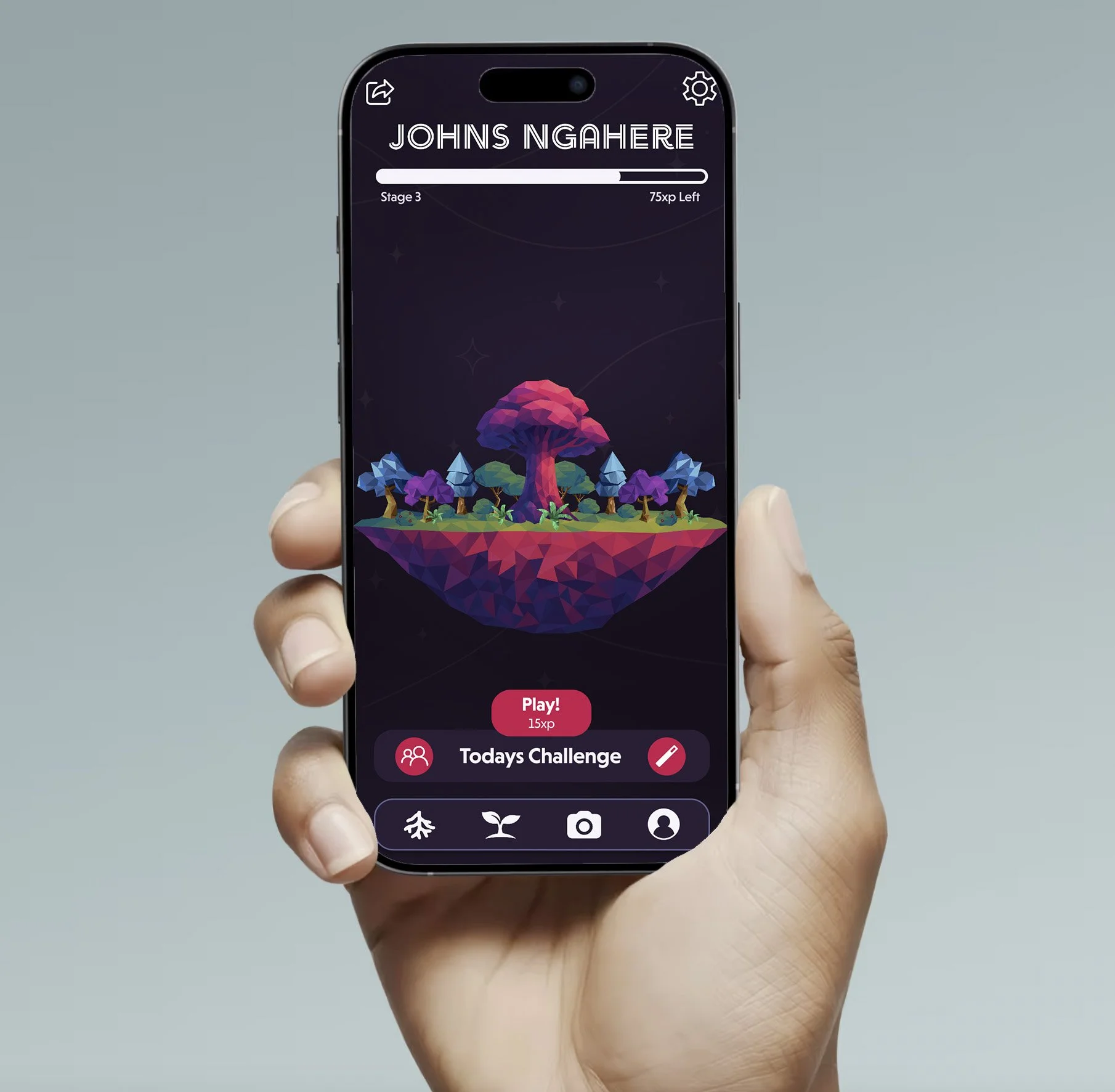
The IDea
By gamifying the app into a living interactive journey showing visual progress through a personal forest and Kauri tree, users are able to earn rewards through a variety of mini games where they are able to tell a unique story to them all while learning Māori.
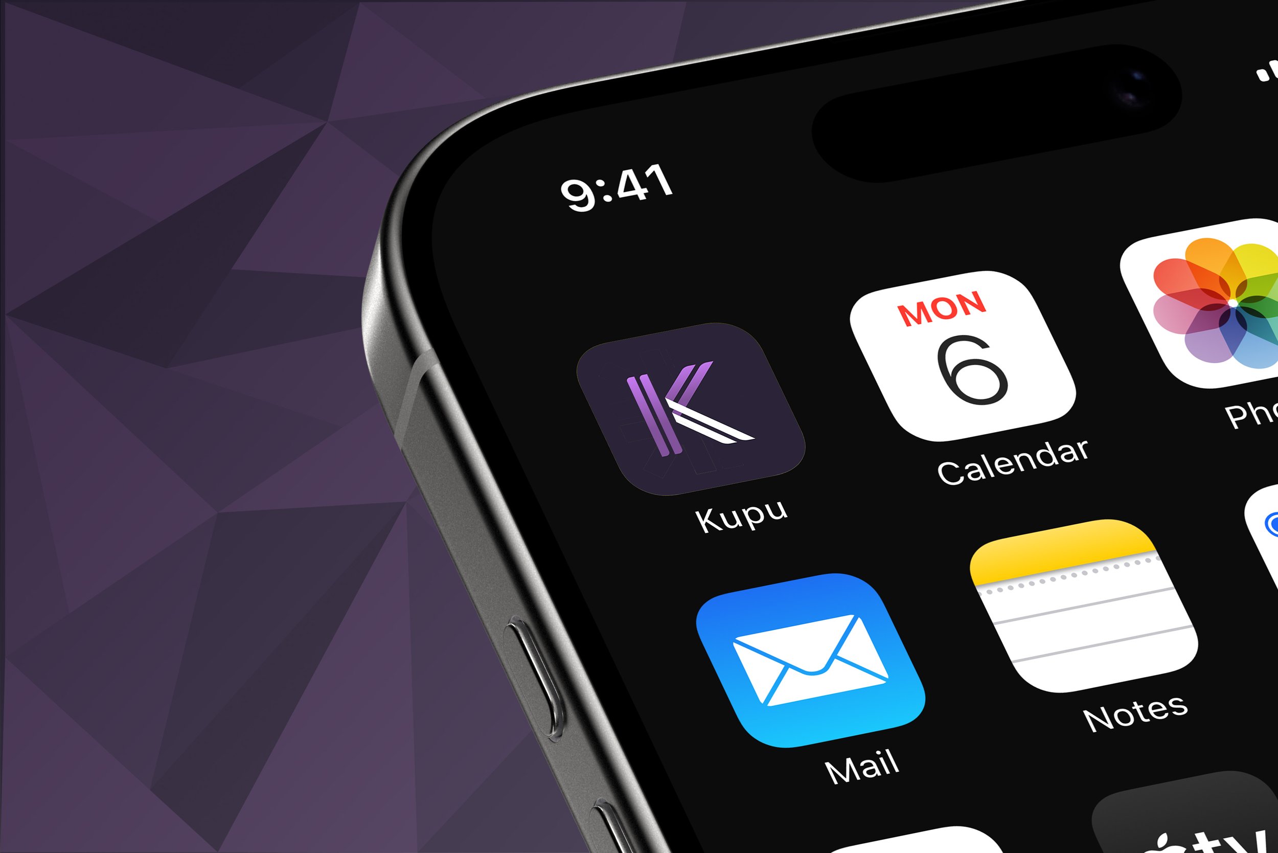
Kupu Logo
The logo for the Kupu app was inspired by the original design inspiration of weaving, weaving being a strong theme for Māori for both practical and cultural reasons. Using a font that acted as flax then making refinements to show its playfulness especially through the ‘K’

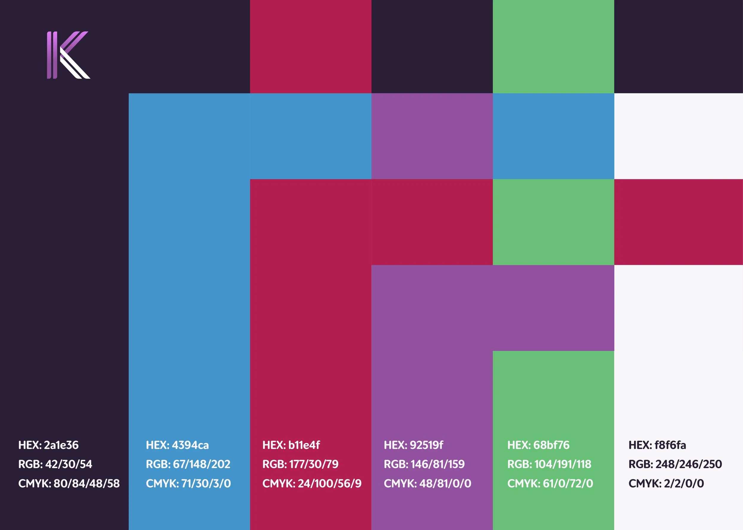
Kupu Colours
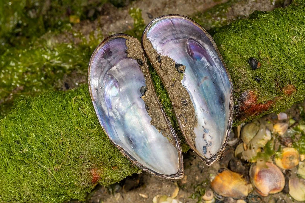
Inspired by Avatar (2009), Māori art works and the natural environment around us such as mussel shells. These inspirations helped in furthering the connection to the Māori people we are designing for.
Producing a colour palette that worked well with the tone of voice we had for the new Kupu app with each colour having its own meaning
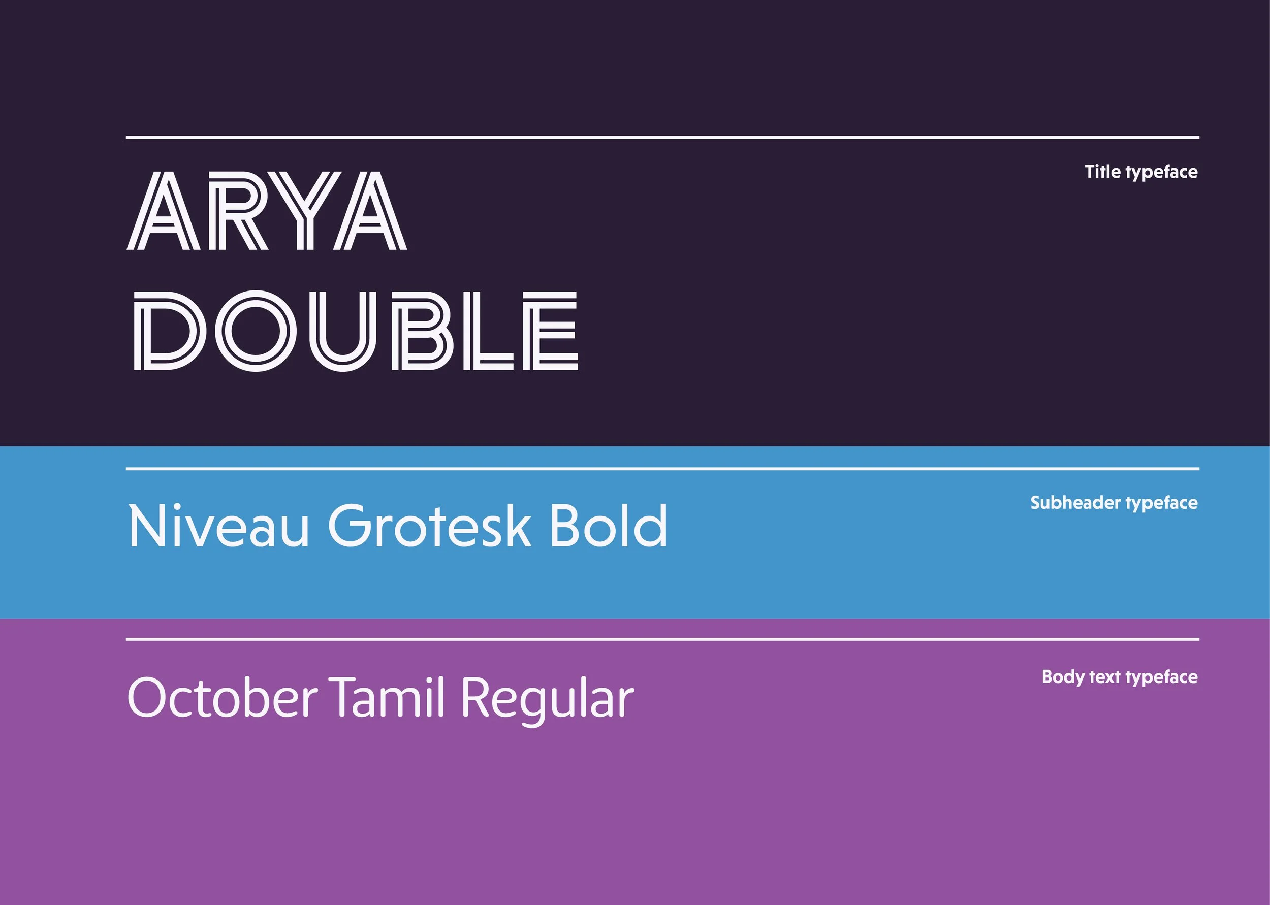
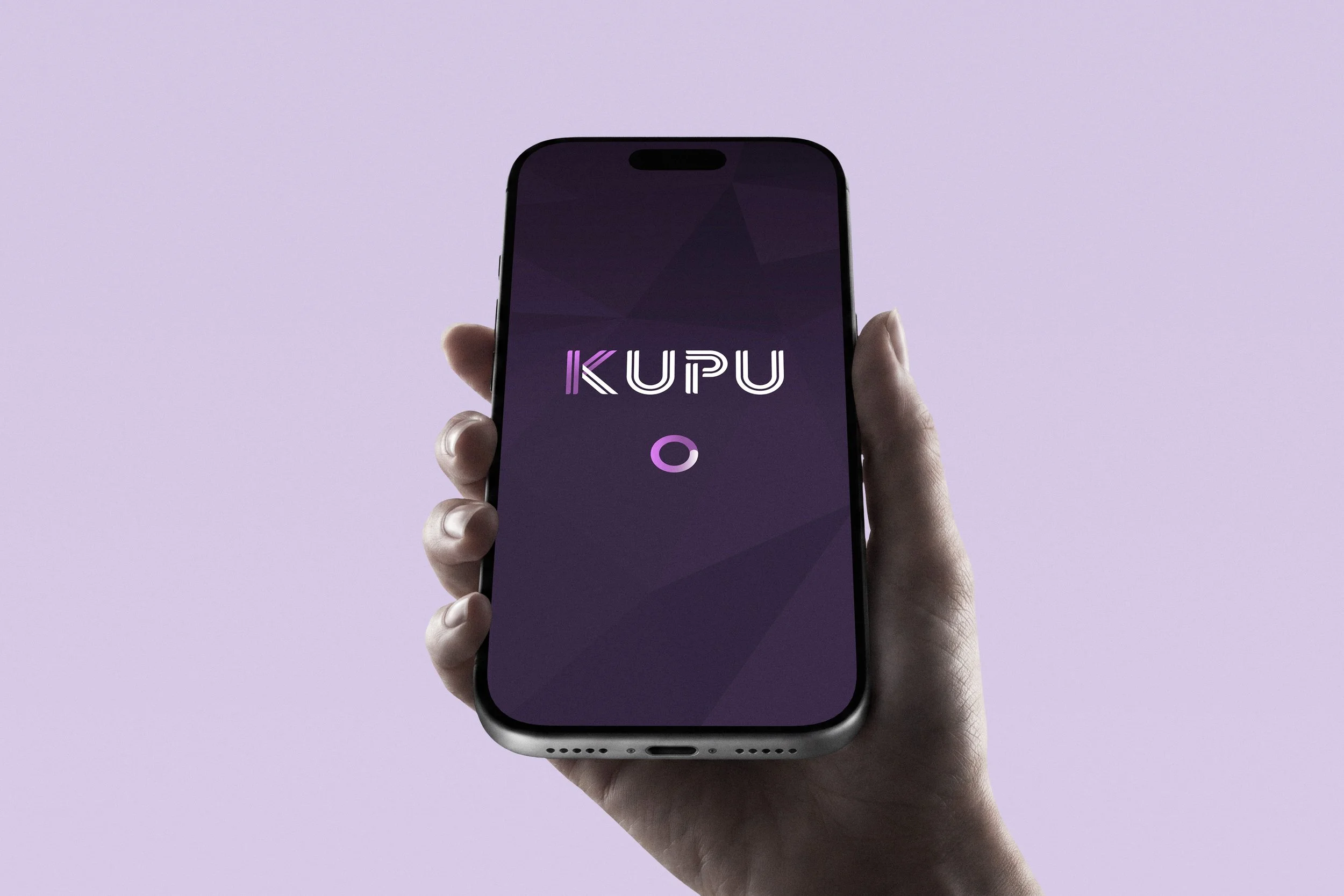
Typography
The title font used within the brands typography palette shows a double-lined sans-serif font, which I believe works well from the inspiration of weaving in Māori culture.
The subheader is set in a sans-serif font that has some character while remaining professional and legible.
With the body text font having rounded edges to show some playfulness, breaking the bond of the very bold typefaces.

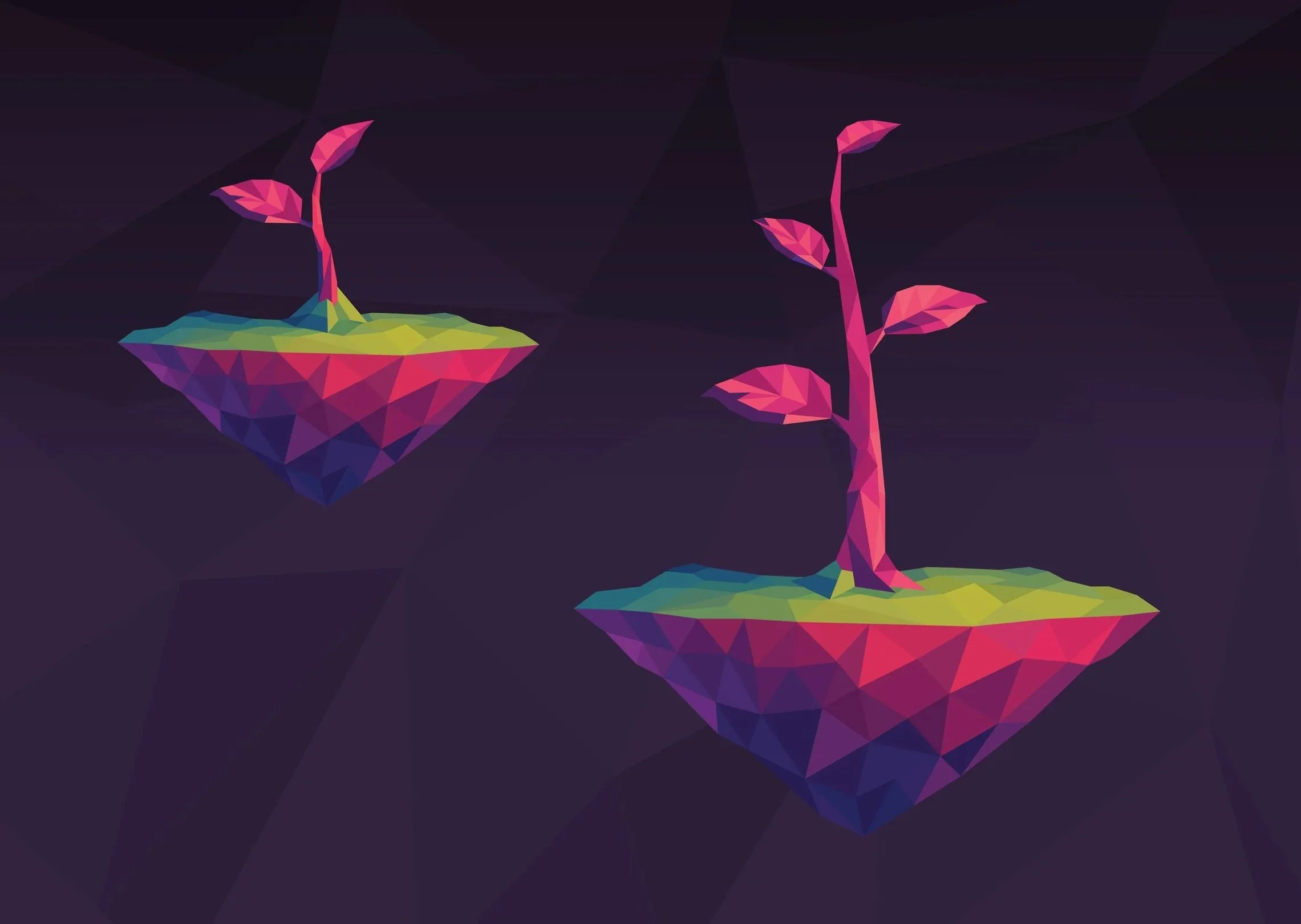
Brand Assets/ Illustration
The brands assets for the Kupu app were made in Illustrator in a low poly illustration style. This style connected well with our idea of gamifying the Kupu app to help users feel an escape into another world that they create.
The trees and plants we took inspiration from native flora in New Zealand and using colour within our branding for some of these plants, fitting with our visual direction.