ROots Haircare
ROOTS is a haircare brand curated for Pacific Islanders to help assist in their hair care journeys, connecting to their roots so they feel empowered, seen, and loved.
Brand Identity
Details
Project Type: Individual Project / Student Project
Category: Haircare Brand
Project Duration: 8 Weeks
Scope of Work: Brand Identity
Brief
To investigate a creative project that explores a context, subject, and medium within the field of media design.
Design Question
How can I use Brand Identity in a culturally designed context to help empower and connect Pacific Island people in their curly haircare journey?
Design Idea
Creating a Brand Identity for a hypothetical Hair care brand that connects with Pacific Islanders, helping them embrace their natural hair in their hair care journey.
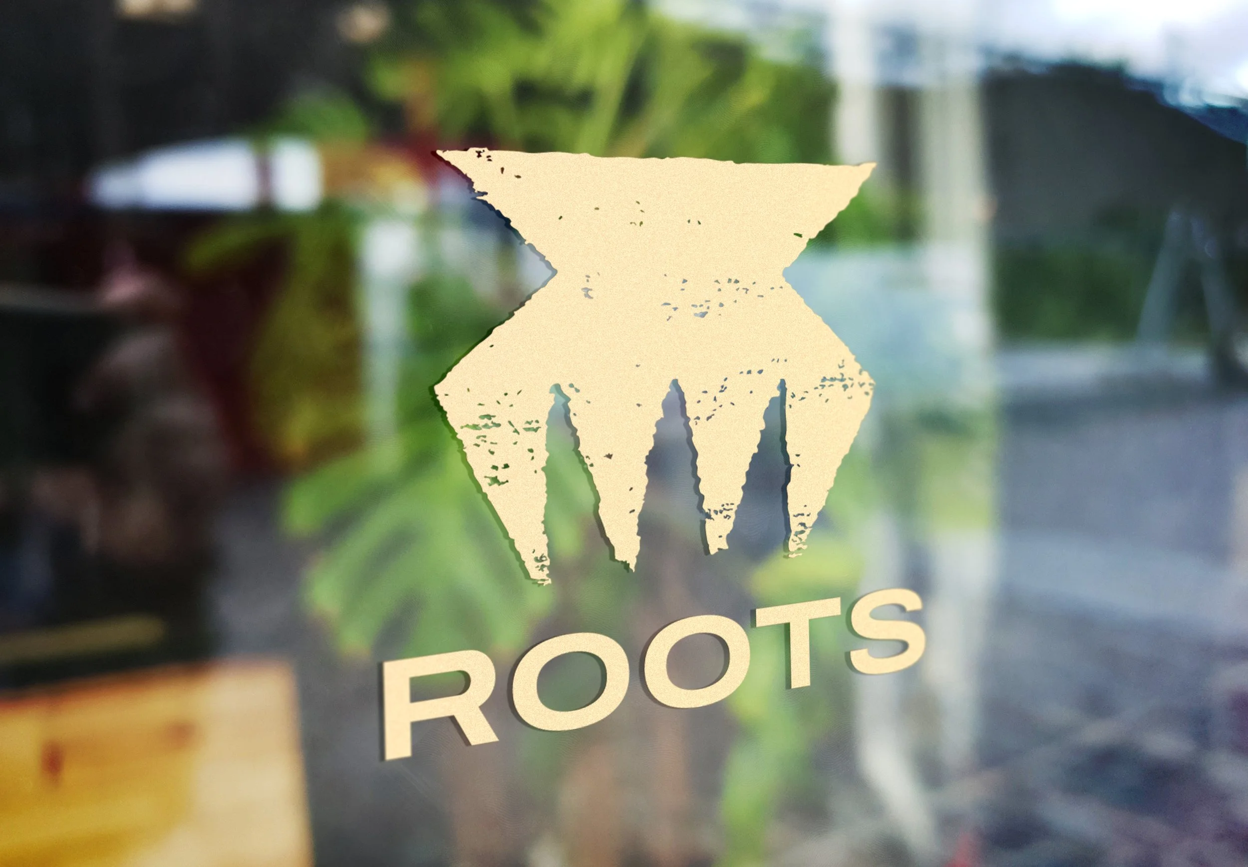
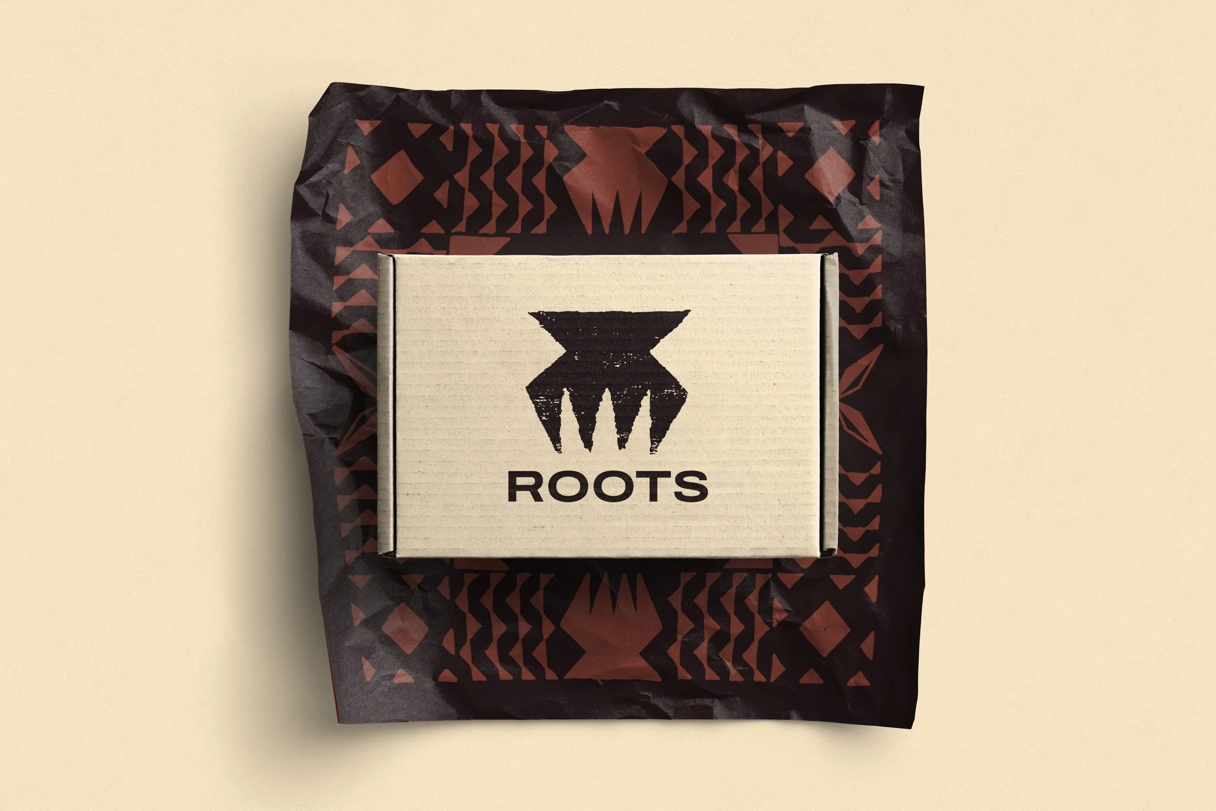
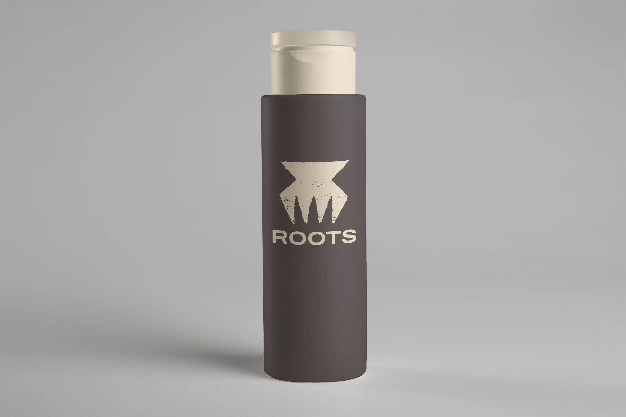
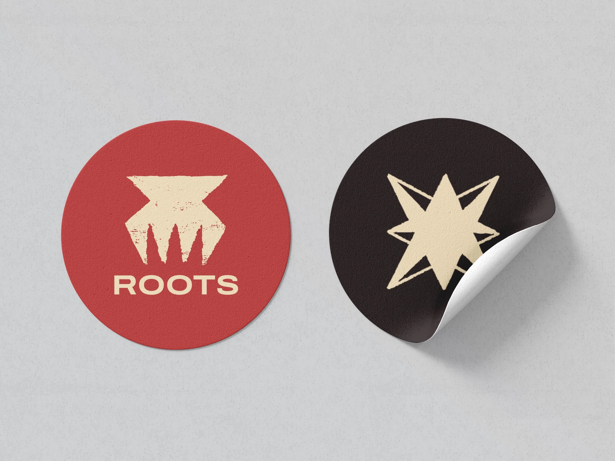
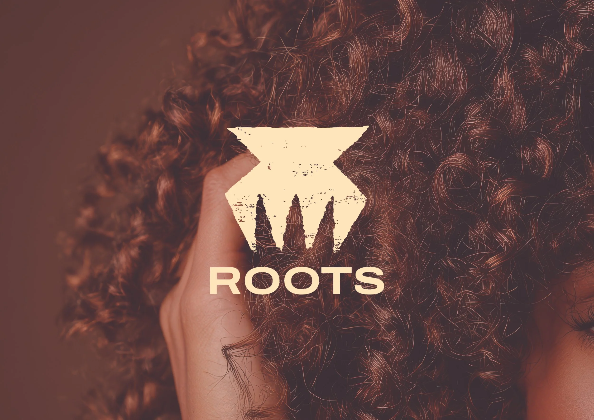
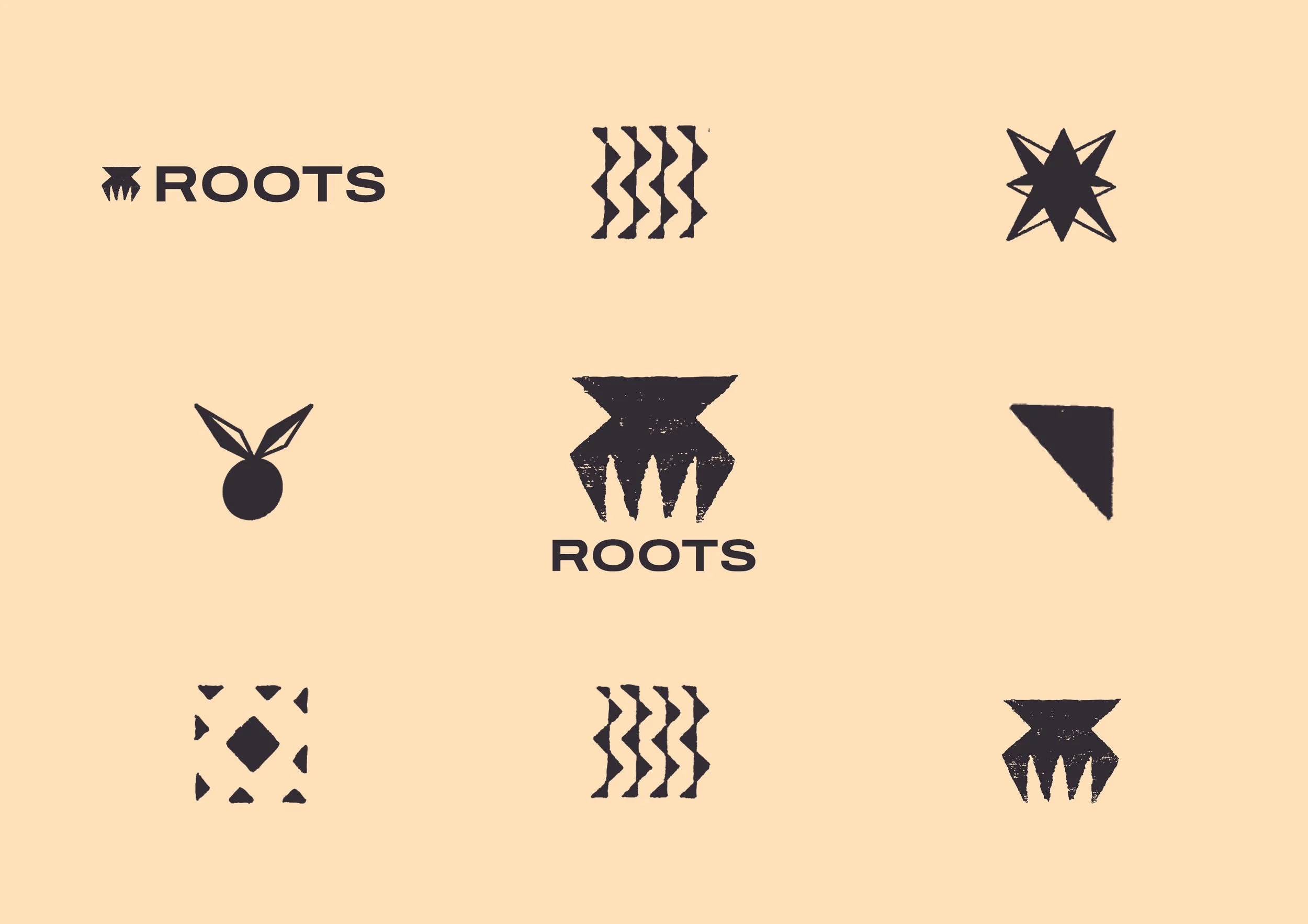
The Logo for ROOTS takes the shape of a hair comb that was used in the Pacific. Inspired by the geometric shapes found in patterns across the Pacific, the ROOTS logo was made.
The logo uses a stamping/ printing texture that was done through a hands on approach of carving the logo on wood to then printing on paper to create the final outcome for an authentic icon for the logo.
Logo
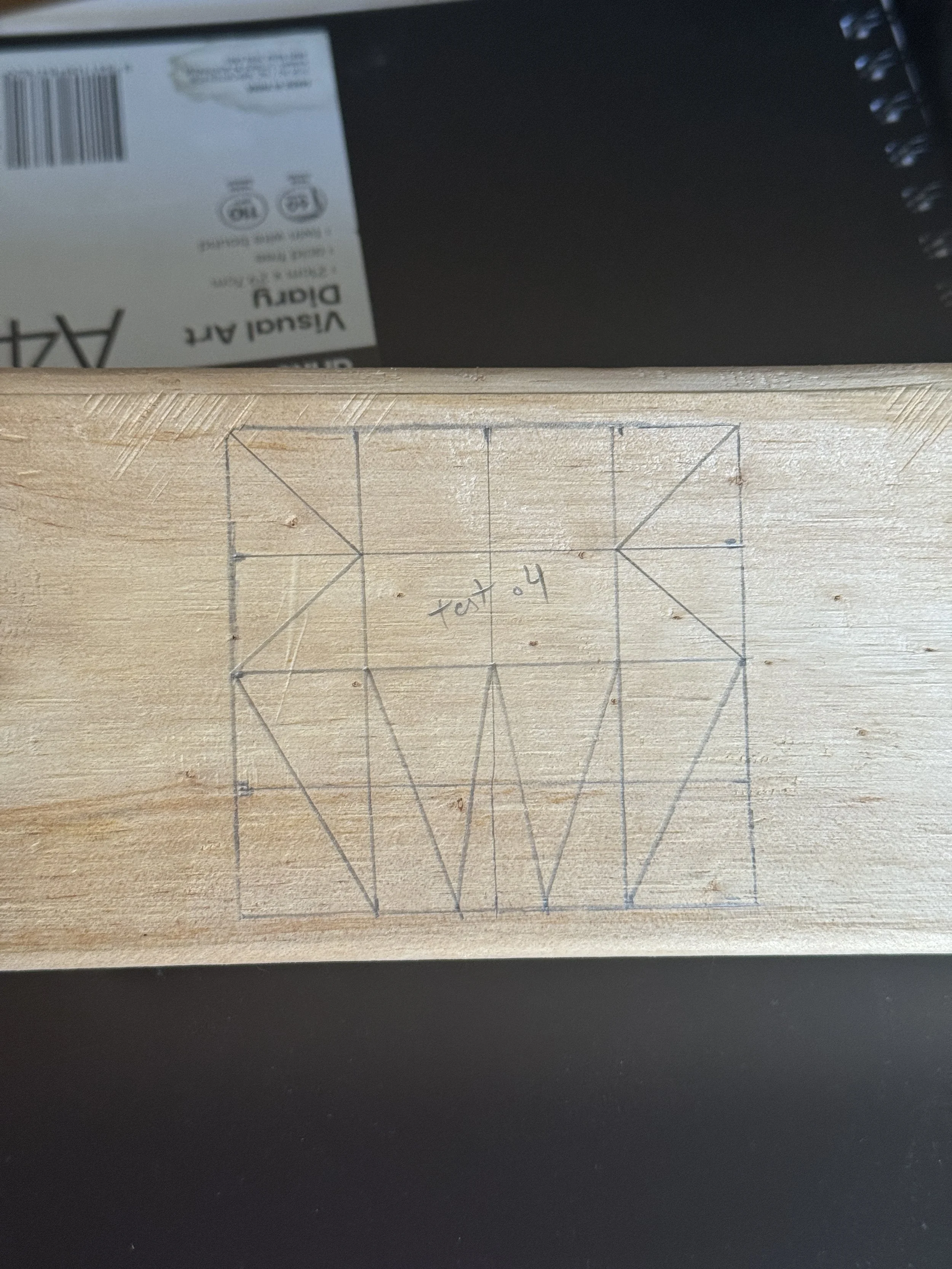
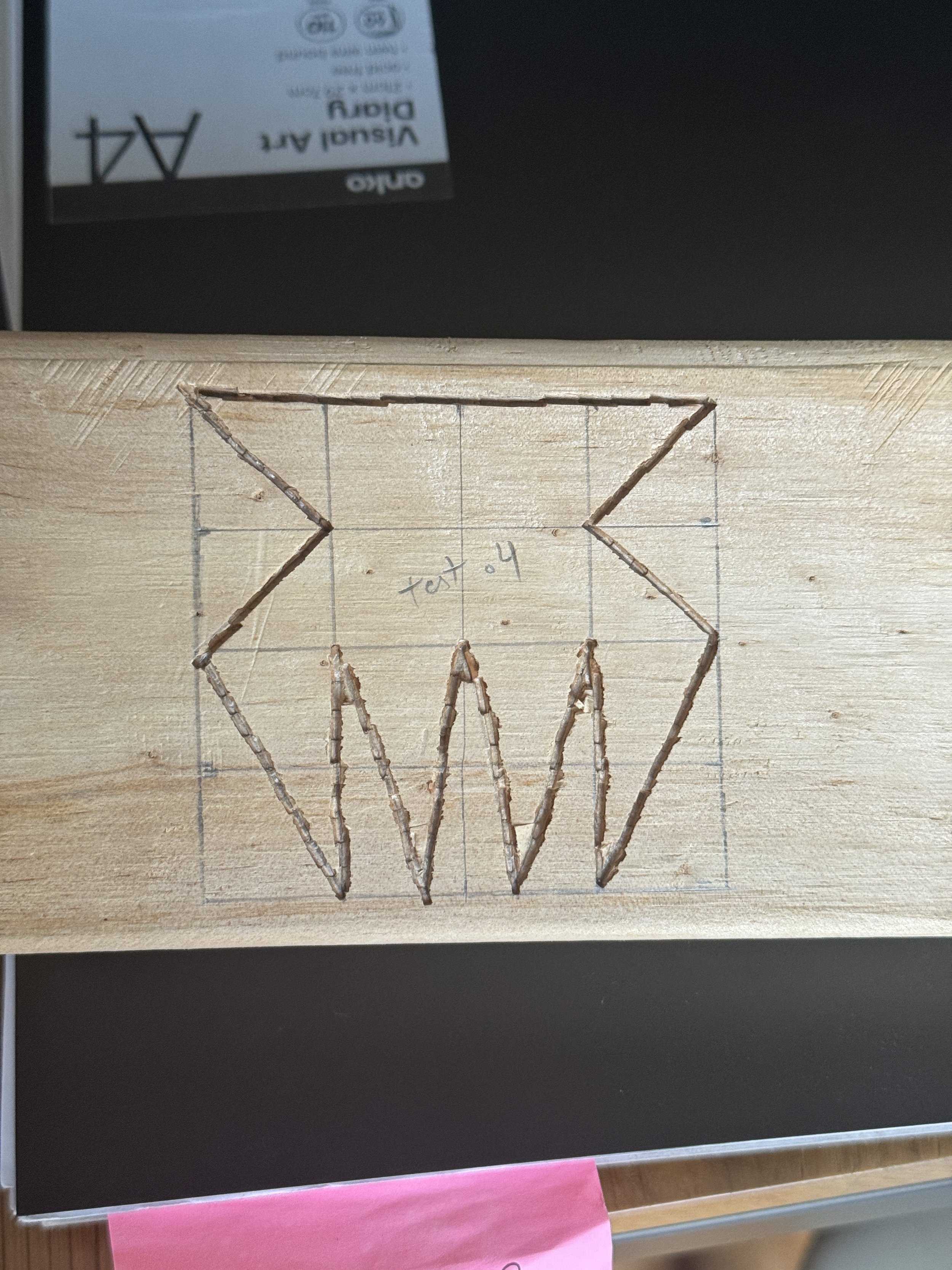
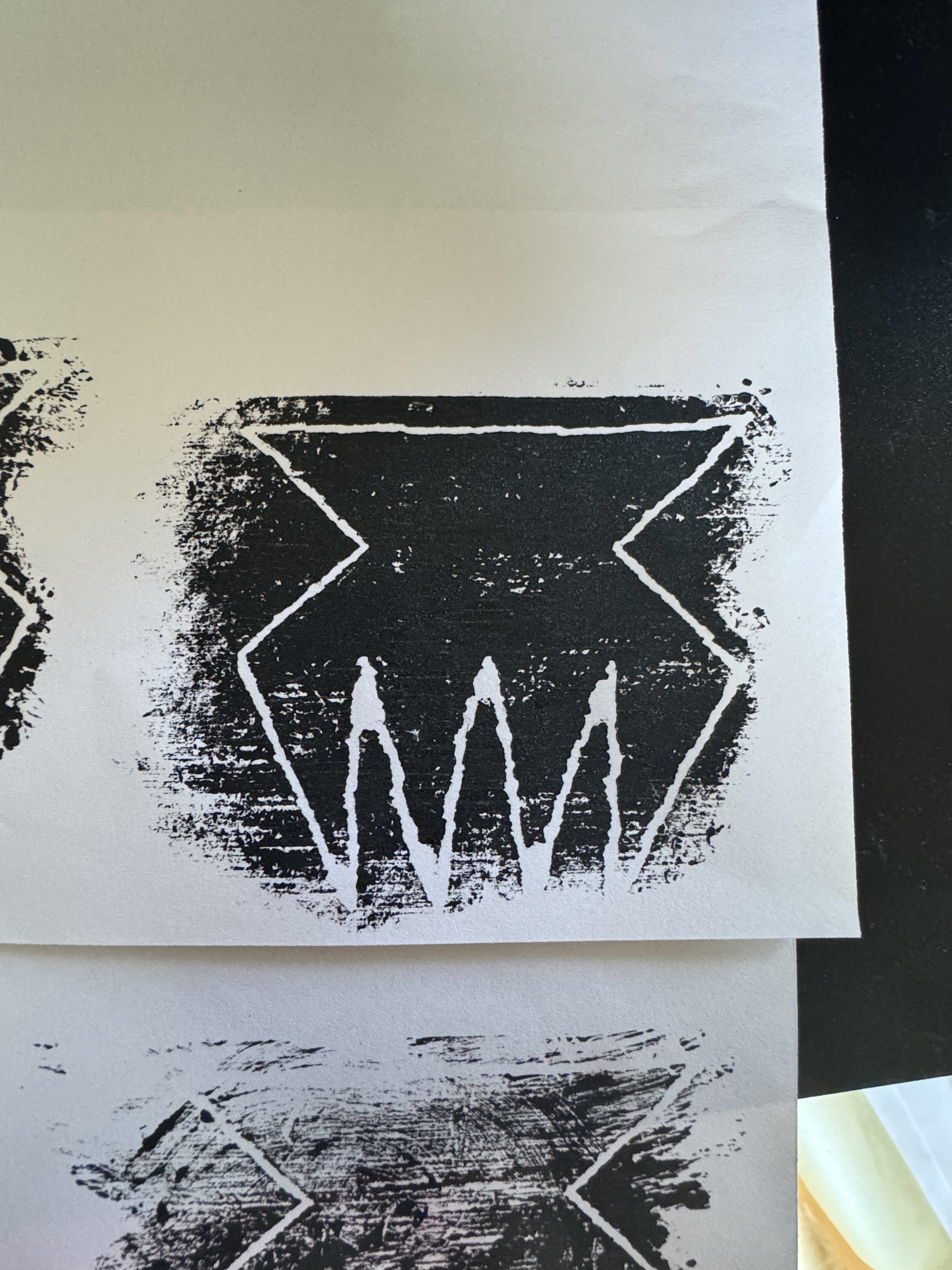
Testing was done for the logo used cultural design research into rubbing tablets (Kupesi), stencils, hand printing, and more.
Carving the final logo design into wood, then applying black paint for a clear contrast of the outlined shape, and finally digitising by scanning the print for final refinements for the final outcome.
Logo Process
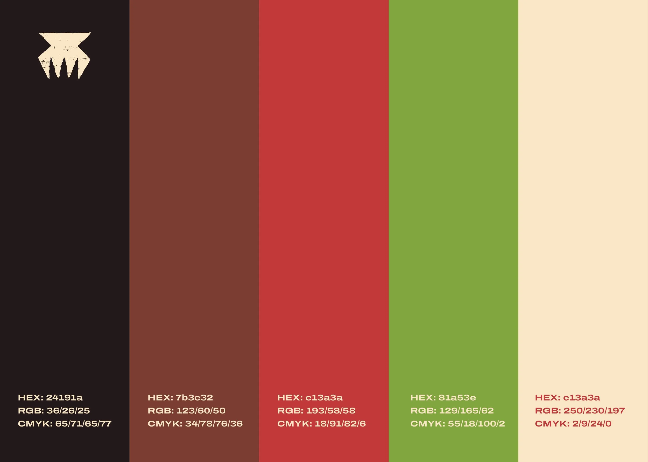
ROOTS Branding colours were inspired by natural and earthy tones drawing from colour found on tapa cloth.
Using the off white colour from the natural colour of tapa, the brown found from clay and bark, the gathering of clay to get a red hue, and the dark brown soot colour resemblance of black, then introducing a green colour inspired by green coconuts to convey healing, all colours keeping to the earthy tones.
Colour Palette
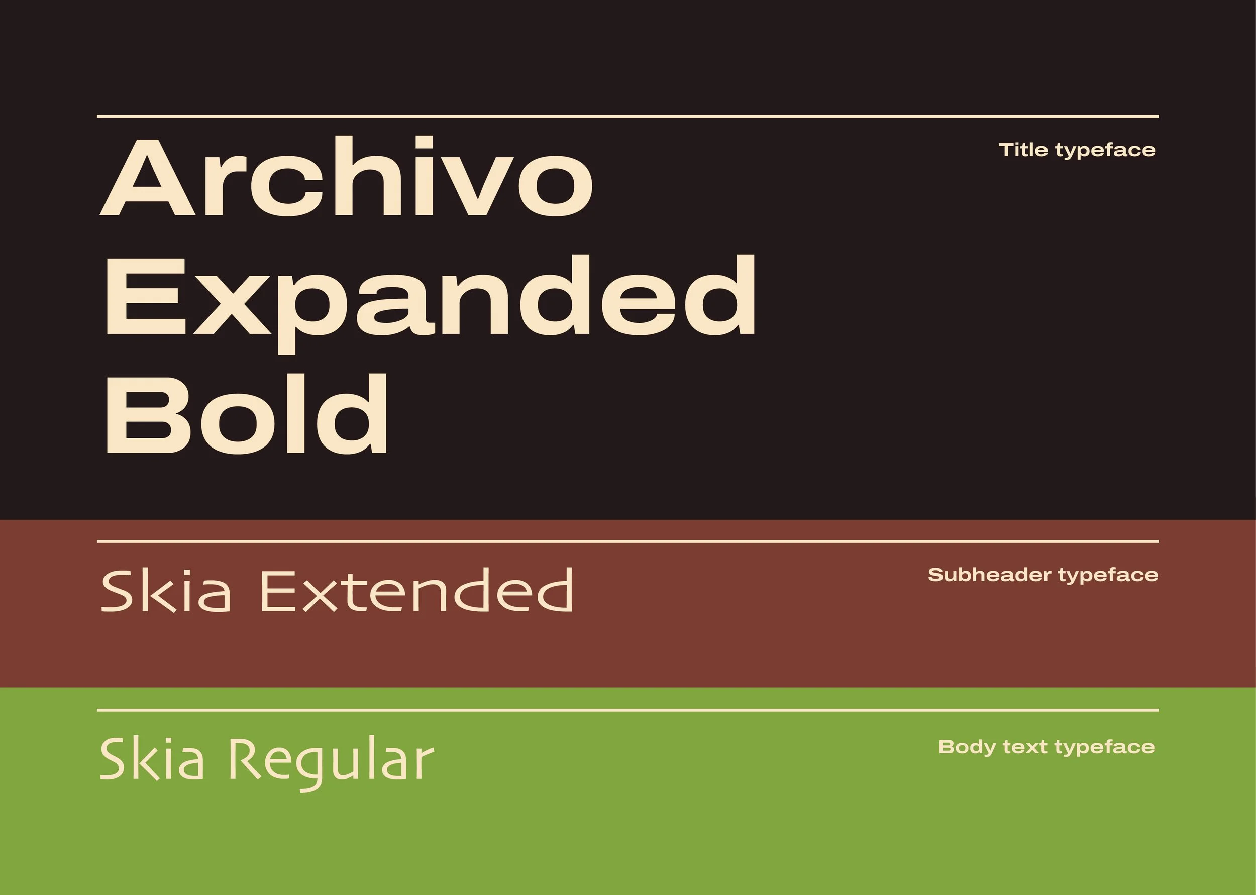
Fonts being used within the branding for ROOTS shows a strong, bold font for the title typeface that reinforces and shows the brand’s mission of empowering a community. A humanist sans-serif font is being used for the subheader and body text. Inspired by the brand’s identity of carving, this font matched well.
Typefaces
Assets
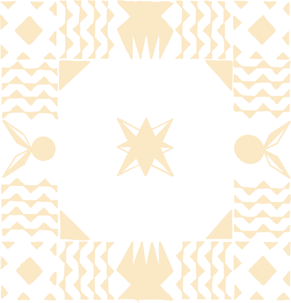
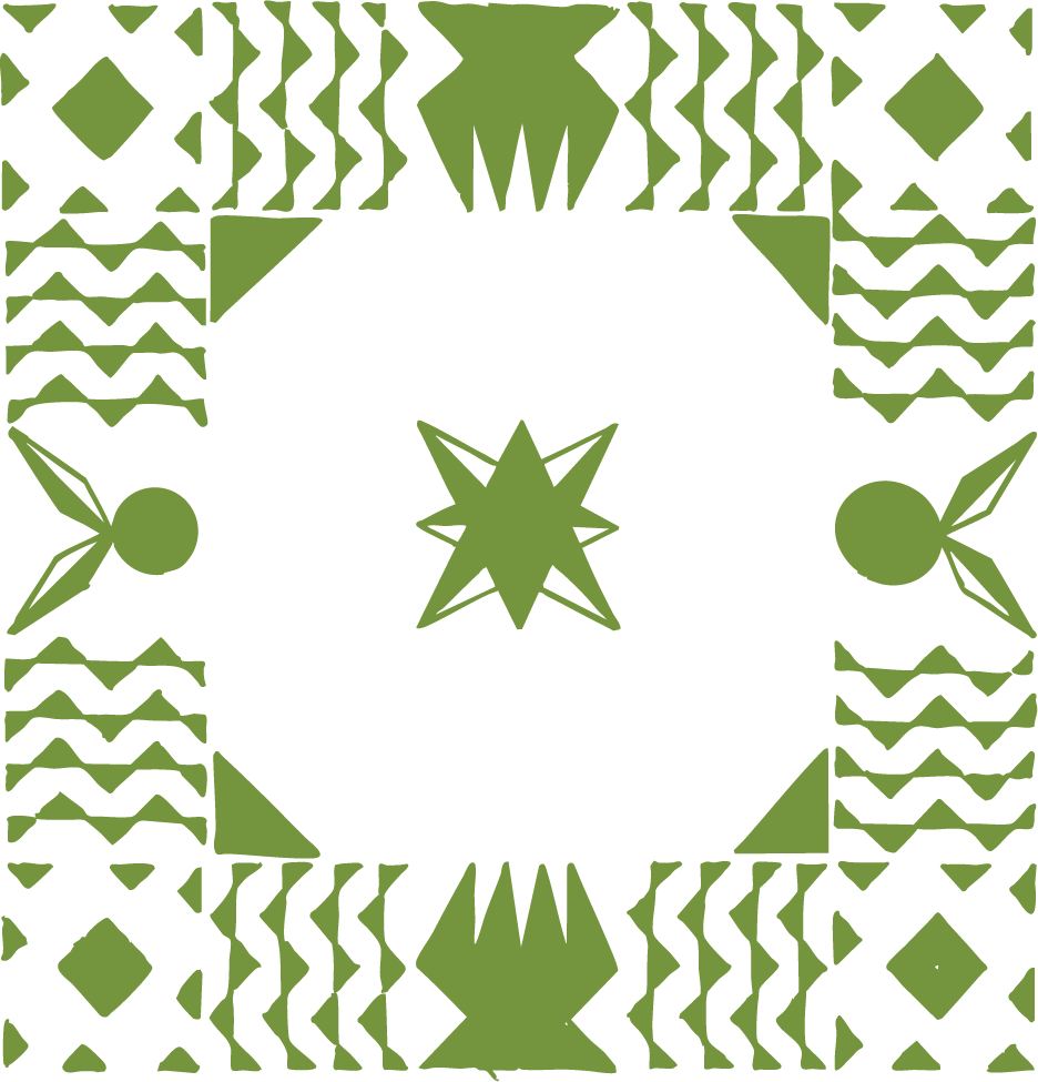
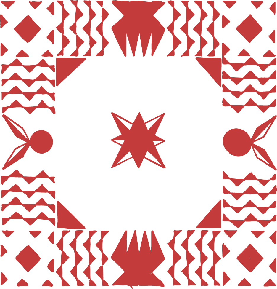
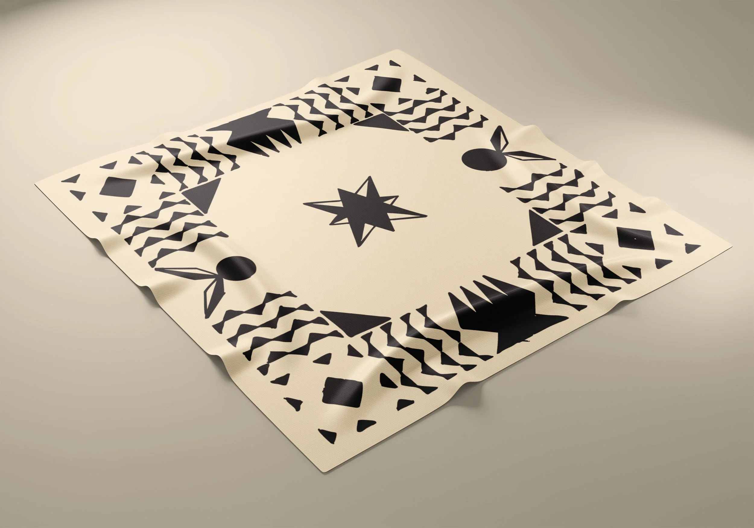
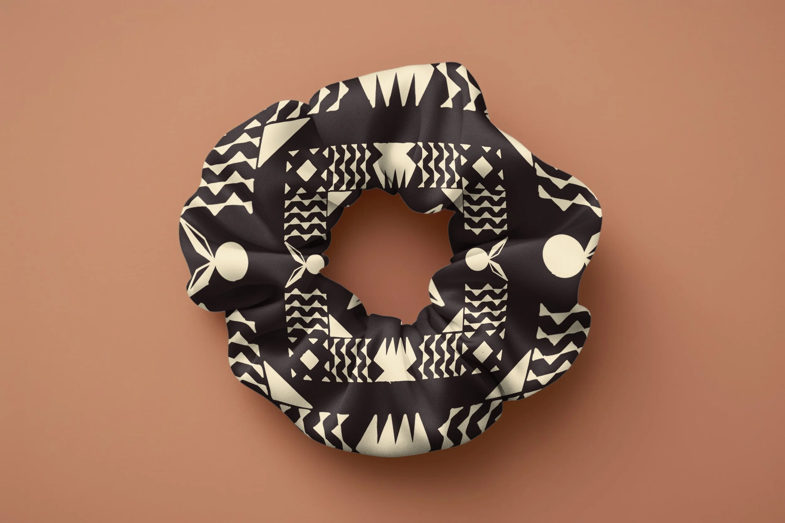
ROOTS branding uses an original pattern inspired by the different patterns found across the pacific on tapa cloth. These patterns were hand drawn to give an authentic feel to the craft and brands identity. Each pattern holds a meaning relating to hair and pacific culture where put together tells a story of journey, centering our brand as a solution to healthier hair.