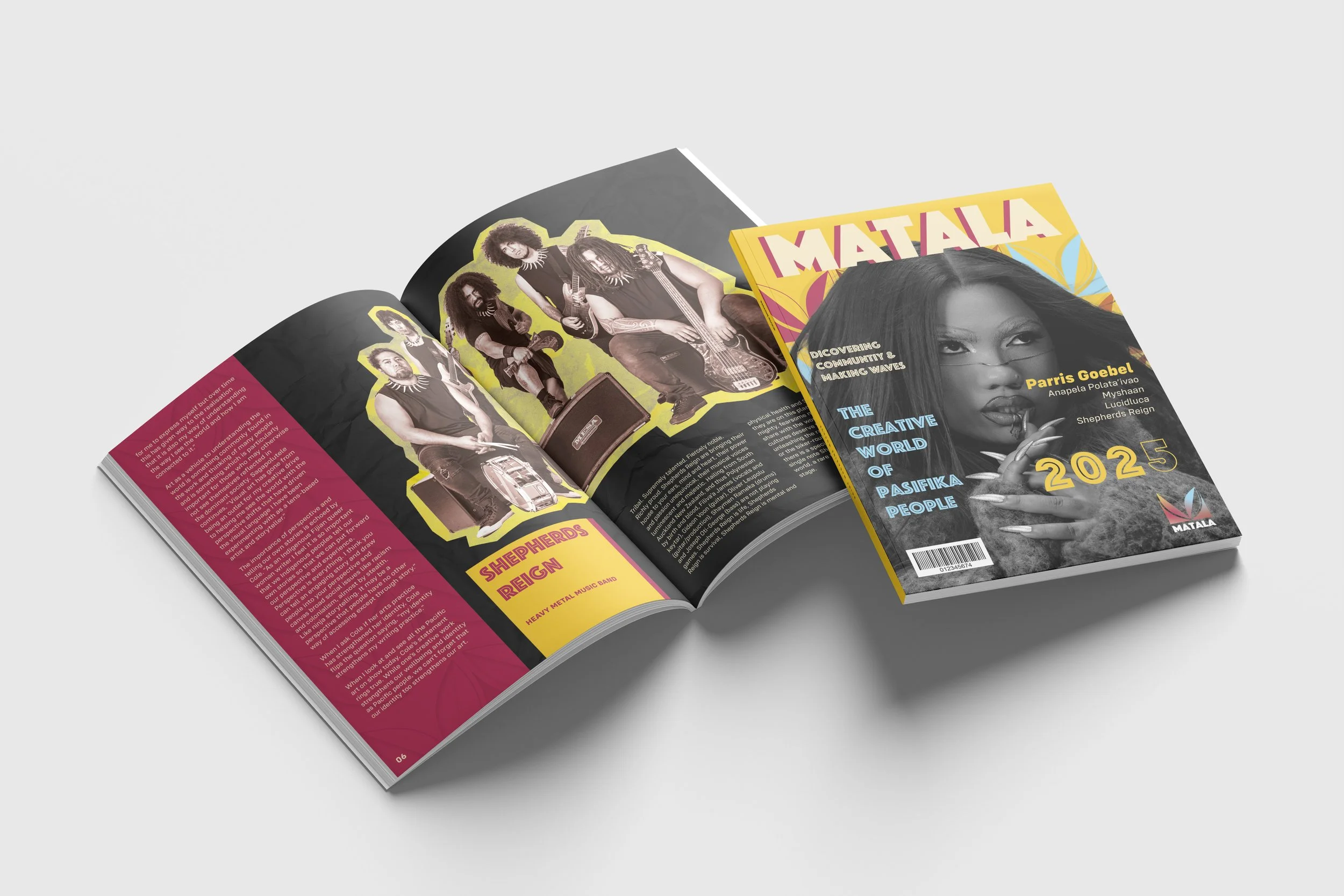
Matala Magazine
Matala is a Tongan word that means flower/ to bloom. The core idea behind the magazine is to shine light on the Pacific community within creative spaces, giving Pacific youth the motivation and empowerment to chase goals and see how far those goals can take them.

Brand Identity
Details
Project Type: Individual Project
Category: Magazine
Project Duration: 8 Weeks
Scope of Work: Brand Identity & Publication
Brief
Create and pitch a new magazine to compete in the Aotearoa New Zealand Magazine marketplace.
Design Solution
Creating a magazine for Pacific Island youth in creative spaces that shines light and provides a platform for the pacific community so they feel inspired and empowered
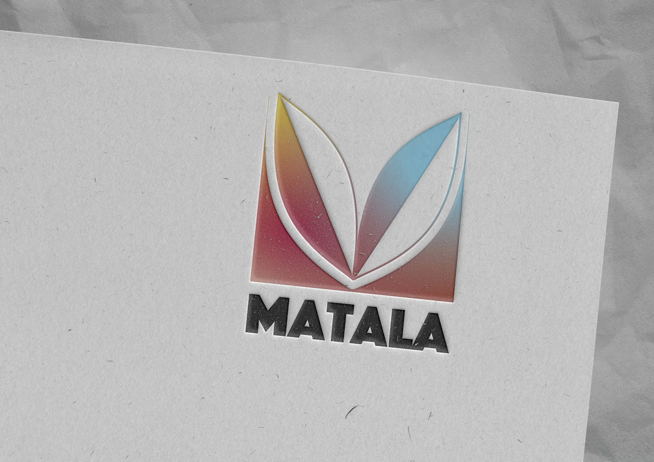
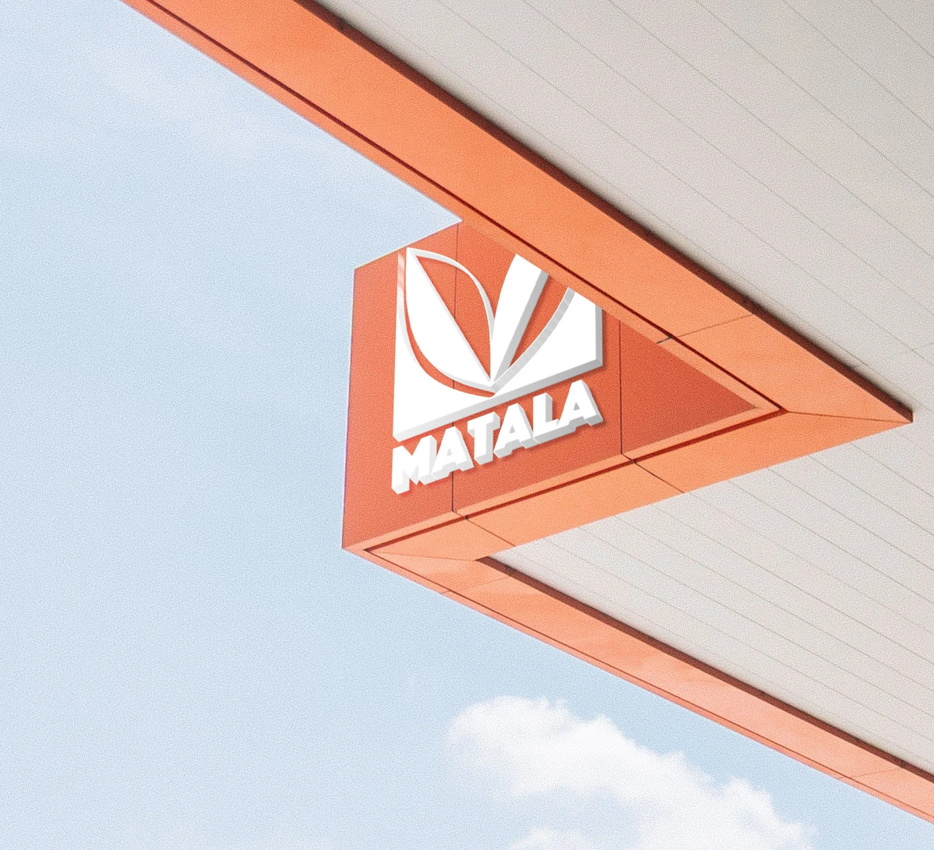
Logo
The logo uses an icon that was inspired by Pacific island patterns (Manulua & Pacific flower) Designing to incorporate these patterns into a icon that resembles an ‘M’ reltaing to the first letter of the Magazines name ‘Matala’.
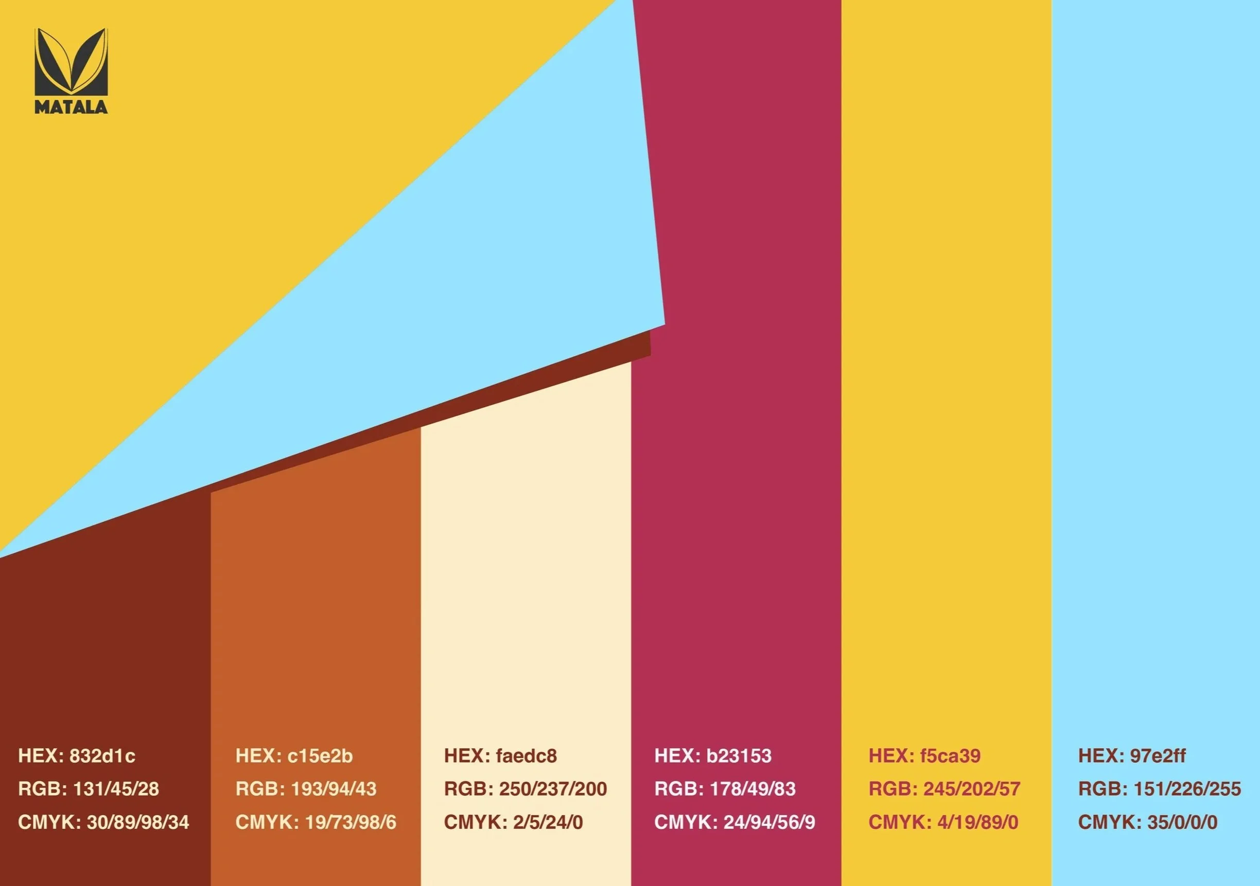
Magazine Colours
The colours behind the magazine reflect cultural and creative emotions being evoked. The browns influenced by the colour found on tapa and the vibrant colour influenced by creativity being evoked, bringing life and energy to the palette.
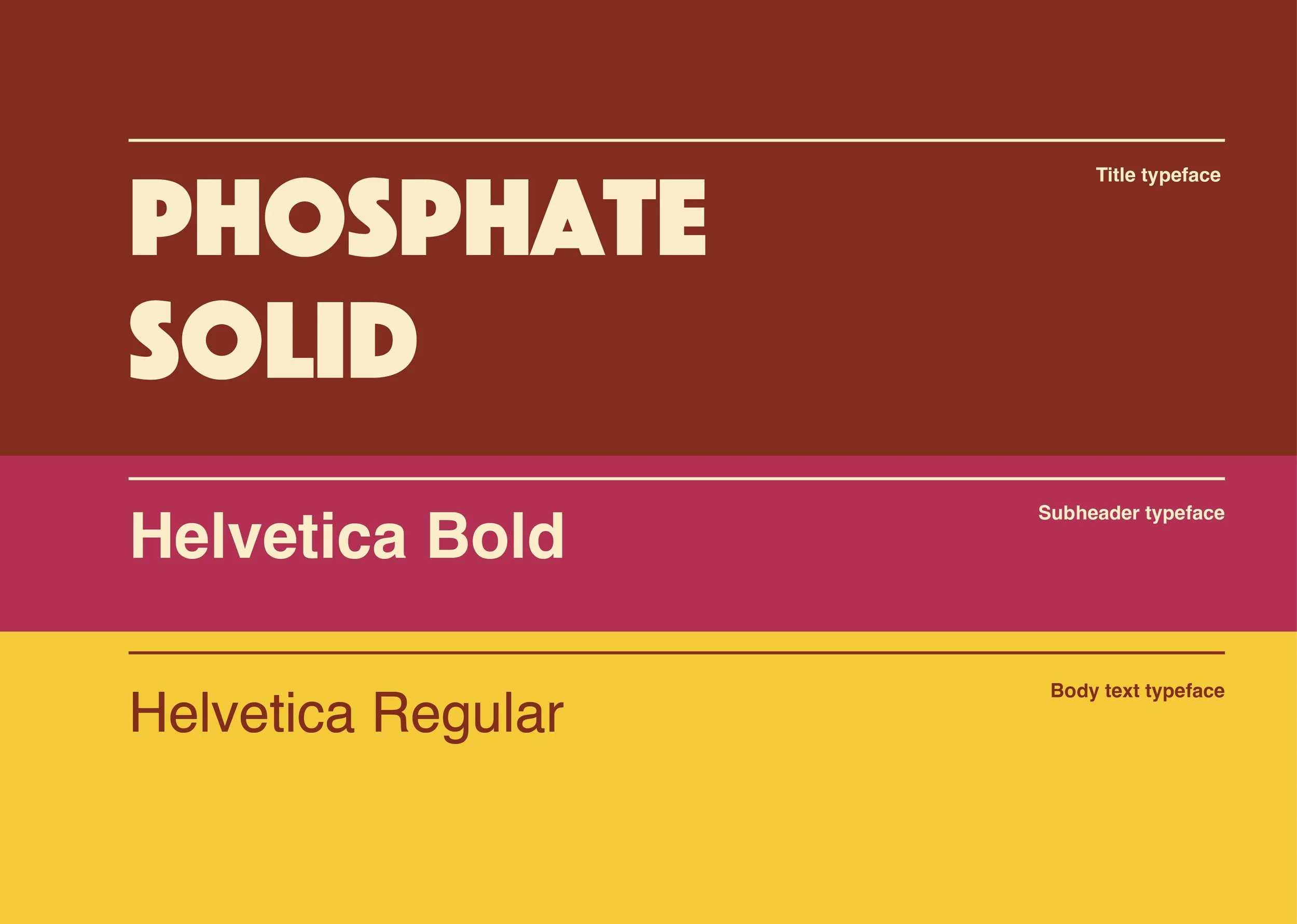
Typography
The typefaces used for the magazine’s branding show a very strong, bold, and minor characteristic typeface that works well for legibility in how the brand’s tone is conveyed.
The subheader and body text typeface is simple, using Helvetica for a clear, legible font, especially for a magazine containing a lot of words.

Content
The content included in the magazine showcases Pacific Islanders from a variety of creative spaces, including acting, music, dance, and fashion.
The process of designing the magazine, I knew I had to connect to my audience of young adults and show this in a fun and creative way, such as scrap book/ collage.